Interview with a Material Artist

General / 24 May 2022

This year I have been almost 10 years in the games industry and wanted to share my ideas and answer questions that I have gotten over the years but didn't get to answer. Hopefully my blogpost will inspire you and help you find your way within the industry or maybe even help you find your niche?
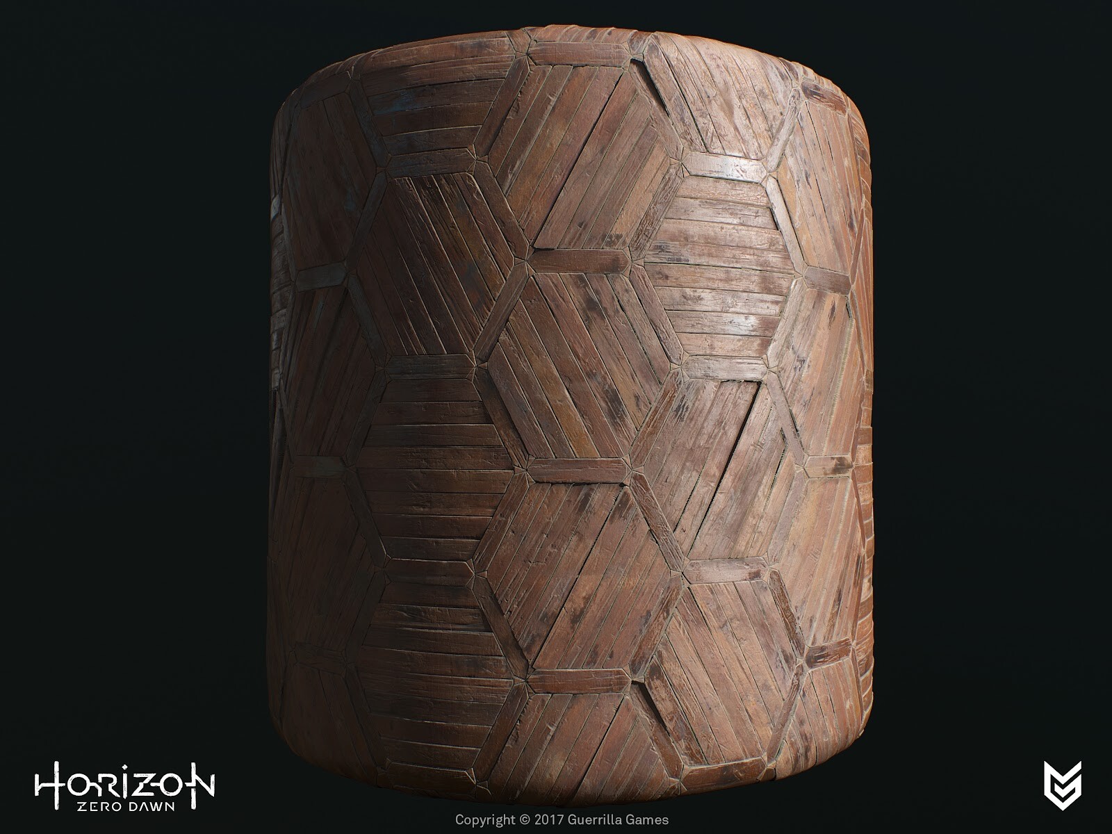
How did you get into such a cool IP as Horizon? What sort of brought you in this direction?
Back in 2012 I was already an intern at the studio, a couple of years before I rejoined in 2014, however during my internship I did see some early concept art for this new IP now called Horizon. When I was about to join the team I didn't know for sure which project I'd be working on but, as you can imagine, I had my suspicions. Back then I was mostly working on assets or environment-art but was also looking into creating shaders and material expressions. This technical interest landed me the shader/texture artist position and started delving deeper into this area of expertise over the last couple of years.


What was your general approach to assets in this production? You’ve had quite a tricky task, building all those amazing materials. How did you decide to tackle this?
During the concept phase there were already a whole lot of reference images available (collected by our talented Concept-Artist and Directors) but also my Art-Director had specifications of what he was looking for. The target was to blend this look from the proposed Concept Art and the requirements of the Environment-team/Art-Director(s) and of course I had my own input. From these reference images I have created a huge reference sheet with everything I found interesting per image and from there we picked and chose which characteristics we liked and added callouts to highlight what we felt was necessary to sell the idea of the materials. This really helps to get everyone on board with the exact look we were going for.For any artist I'd suggest; always try to collect images to build your own material library, this can be Pinterest or snapshots on holiday. I do this and then after one or two years, I delete everything and refresh my entire collection.
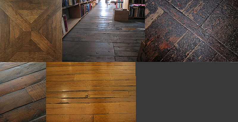
Ref images
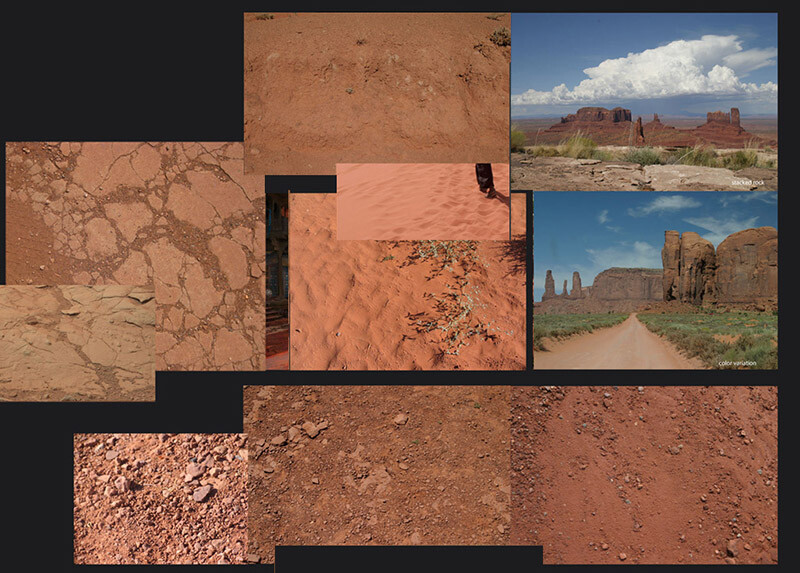
Ref images


You were using Photoshop and ZBrush to craft all those amazing textures. Could you talk in more detail how it all worked?
During the development of previous projects we worked with high poly sculpts in Zbrush to generate detailed heightmap information from those. But when we started implementing Substance with a few textures to get a feel of the program and its workflow. For example with a gravel texture, we generated tiny pebbles and added multiple stacks with offsets and a variety of scaling to make it look more interesting and finalize it with some photo overlays and color correction in Photoshop. 

No matter which program or tool we used, we always focused on getting the height information correct first, before diving into the Color and Roughness values too much. For some textures it felt more comfortable to generate the content in Zbrush as it gave me complete control per brick (or had to match with pre-existing assets/models), I was able to put each brick at an angle or give it height differences to give it some nice parallaxing effect. The downside was: it’s very time consuming. For texturing the albedo/diffuse we tried several approaches, for example: polypainting the bricks in zbrush but we had to keep such a high polycount that Zbrush became unworkable and too little poly density would result in a lack of detail. Then we used Photoshop but now that Substance expanded their libraries a lot is possible now, that wasn't before. I would've picked up a hybrid approach, generated high poly mesh and generated the diffuse and roughness in Substance.


You’ve mentioned that you choose Photoshop because of more control over the subtleties in color/height variation. Why was this more important to you? I mean you could have gotten very similar results Procedurally.
In hindsight I probably could have pulled off a similar result. As the height information was the most important to me, it really sold the textural details and state of the bricks and ultimately sold the believability of the material. In the reference images that were collected, it showed me the importance of all the states of decay that were having subtle tonal variety and height values.

Timelapse of focusing on the height information first.Before adding diffuse/roughness.


How did you make these materials tile in such a beautiful manner? Did you use some other tools to scatter the rocks here and other little things?

With a bit of planning and proper mesh setup, you can easily offset your subtools and align them so it’s tiling perfectly (especially now with Substance Designer in our arsenal). Getting the scale right versus the right amount of detail and uniqueness is tricky. Each brick was placed as a unique subtool, so it could easily get warped and moved around. We iterated many times on the brick layout to get the right feel before we proceeded with the Diffuse/Albedo/Roughness maps.

The scattering of rocks was a combination with custom Maya scripts where I could scatter kitbashed rocks or in Substance Designer. Scattering rocks with photo scanned data was interesting to familiarize yourself with generating procedural content and also match it with pre-existing photoreal content.


You’ve done some absolutely stunning work with the brick wall. It’s like the most favorite subject of every texture artist, but your material is something else. Can you tell us, how did you manage to build it in such a way that the brick wall actually has information about 3 types of bricks: old, worn down and new. 

Planning was very essential for this to succeed. First we started blocking out the intact version of the bricks and tested the look and feel of the layout in-game. We checked for scale, height variation, repeating elements - even a flat color in the albedo with some curvature and ambient occlusion information can help a lot visually to give a feel of the surface and readability over distance.

I then reworked the high poly sculpt and baked out maps for the first pass - I grab all the baked maps, e.g. Position to World Space Normals, custom mat caps in Zbrush. This gives me a wide variety of masking methods I can pick and choose from to create the tonal variety. Blending the Curvature map with the Position map and a random (brick) variation mask, created interesting variations. Next step is to apply more colors by adding photos, mask out bricks based on height or manually select them, add tonal gradients with the HSL slider/node for per brick subtle variations.

For the second material we used the exact same layout in Zbrush and started to replace bricks of the same size or used the well known Dam standard brush or Orb Crack brush combined with a custom alpha mask to split up the bricks or use the TrimSmoothBorder brush to soften the edges (as worn brick does over time). On certain bricks we would add some alpha stamps to make the brick look more damaged. Or by moving some bricks even lower and skewed which emphasized the aging process even more.


How did they help you to nail that beautiful hard surface stuff?

Maarten (Art Director) and I were looking for a way to speed up the texturing process but also maintain the quality that was pushed throughout the game. The two of us decided to delve deeper into the Substance packages and set up custom nodes and materials which also extended our internal Substance library. During this iteration process of creating nodes and testing them, we created a smart material that we could apply to almost all the assets. In 90% of the cases it would get us there and in some cases there were some tweaks needed but it sped up the art creation process quite a lot. Between the two of us we managed to export 45-ish component sets within two days with all the latest smart materials updated and correct masking for detail maps.


How did you work on those wonderful rusty elements in the production? How were these set up? What were the challenges in these assets?

The rusty element was an iterative process of creating custom Substance nodes. First, we started making generic materials with some light wear, tear and discoloration. In the second iteration, we started adding things like dust, dirt and rust. To get the realism we were looking for, we worked on custom mask generators, e.g. rust got stored into its own user-channel, which took Ambient Occlusion and Curvature in mind. With an additional custom node, we can generate streaks based on the rust mask user-channel, this gives us the drips and very long streaks.


Over all, to finalize, how did these materials help to tell the story in the environment? Why do you think they are even important for these humongous productions?

Material expressions are supposed to give the player the idea that they are in a believable world, that it becomes almost tangible. If a material looks ‘off’ it will break that illusion and snap the player right out of the immersion. The materials will tell the story the world is being lived in, it shows age and beauty. But also the interaction between materials, how water affects wood or metal for example or what erosion does to rocks or bricks. No matter how large the production environment is, you can do this kind of environmental storytelling in all sorts of ways.


Day 18 - 🔬 Deep Dive - Linear Luminance

General / 26 May 2026

Light doesn't behave the way your eyes tell you it does. Understanding the difference is what separates renders that look lit from renders that look real.

What Is Luminance

Luminance is the amount of light emitted or reflected from a surface per unit area, in a given direction. It is a physical quantity, measured in candelas per square-meter (cd/m²), and it describes what is actually happening with the light, not how a person perceives it.

Brightness is different. Brightness is a perceptual response, how the visual system interprets incoming luminance. Two surfaces with the same luminance can look different in brightness depending on context, surrounding values, and adaptation state.

The distinction matters in rendering because the math works with luminance, but the artist is looking at perceived brightness. Confusing the two is one of the most common reasons lighting setups feel physically off even when the numbers seem right.

How the Eye Perceives Light

The human visual system responds to light logarithmically, not linearly. Doubling the physical luminance of a surface does not look like doubling its brightness. It looks like a modest step at the bright end and a much larger one at the dark end. The eye is far more sensitive to changes in shadow than in highlights.

This is why a candle in a dark room stands out, and the same candle in daylight is simply invisible. It's all about relative light perception. The eye continuously adapts its sensitivity based on the surrounding luminance range, a process called adaptation, which means absolute luminance values matter far less than relative ones.

It also explains why HDR capture and tone mapping exist. No display can reproduce the full luminance range a scene contains, so the pipeline has to compress it in a way that approximates how the eye would have adapted to that scene in reality.

Linear Light vs Perceptual Brightness

Working in linear light means the renderer operates on physically correct values. Energy accumulates correctly - two lights of equal intensity produce twice the luminance at a surface. Falloff follows the inverse square law. Materials reflect the proportionally correct amount of incoming light.

Working in perceptual space feels more intuitive because it matches what the eye sees, but it breaks the physics. Add two perceptual brightness values together and the result is wrong. Apply a falloff curve and the math no longer describes reality.

This is the foundation behind the linear workflow and the Gamma Correction discussed in Day 16. The renderer works in linear to keep the physics intact; the gamma encode at the end maps the result back to something the display and the eye can interpret correctly.


Luminance Ranges in Real Scenes

To understand why tone mapping is necessary, it helps to have a sense of the actual luminance range involved:

The full range the adapted eye can handle spans roughly 10 orders of magnitude. No display or file format captures this. A typical SDR monitor tops out around 100-200 cd/m²; a high-end HDR display might reach 1,000–2,000 cd/m². The sun disk is still a billion times brighter.

Tone mapping is therefore a compression problem, not a correction problem. The goal is not to reproduce the scene accurately - that is physically impossible - but to compress the luminance range into something a display can show while preserving the perceptual relationships the eye would have experienced in the original scene.

Conclusion

Knowing real-world luminance ranges gives you a reference point for setting exposure and tone mapping parameters. Instead of eyeballing until it looks right, you can ask: does my sky sit in a plausible range relative to my shadowed surfaces? Does my interior feel correct relative to the window behind it?

The logarithmic perception point is also practically useful: small numerical changes in dark areas will read as larger perceptual shifts than the same change in bright areas. If your shadow detail is disappearing or your darks feel crushed, the issue is often less about the values themselves and more about where they land relative to the eye's adapted range.

With all the things I am learning regarding luminance, I would love to delve further into tone mapping and measuring luminance myself with a lightmeter and experiment with my own library. I still have a lot to learn about Exposure and how it translates into the digital domain.

© 2026 Stefan Groenewoud - All views are my own, not those of my employer.

Day 17 - 💬 Take - Why Real-Time Lighting Is Harder Than Offline

Article / 22 May 2026

Offline rendering can simply throw more computation at a problem. Real-time can't. That constraint changes everything about how you approach lighting.

This is a take that tends to land awkwardly when I mention it to someone else: real-time lighting is harder than offline rendering.

Offline rendering is what the film industry uses. It produces photorealistic results that real-time can't quite match — though the gap is getting closer, with hardware ray tracing and more material standardization becoming standard in games. Offline path tracers simulate millions of rays per pixel across multiple bounces, catching every caustic, every subtle interreflection, every gradient in a shadow, and penumbras across assets of wildly different scales. How could anything harder than that exist?

The answer is that offline rendering solves a physics problem — over hours, if needed. Real-time rendering solves the same physics problem inside a budget of approximately 16 milliseconds per frame at 60fps. Those are not the same challenge.

Offline Gets to Be Honest

In an offline renderer, the path tracer does something elegant: it simulates light transport as it actually occurs in real life. Rays bounce, scatter, and accumulate energy; the solution is noisy early and accurate late, and you simply wait for it to converge. Add more samples and the result improves. Add more time and it improves further. The algorithm doesn't know or care how long it runs.

This is a fundamentally different problem from real-time. The physics doesn't get simplified or approximated — it gets sampled more or less densely. Errors are statistical noise that averages out, not structural approximations that introduce systematic bias. Offline rendering can portray materials accurately: ground-truth subsurface scattering, physically correct glass refraction and diffraction, volumetric light transport — all tractable given enough time.

Real-time rendering has no such luxury. The frame must finish in 16ms at 60fps. Every technique used in that budget is an approximation of something the path tracer would compute correctly given enough time.

Real-Time Is an Exercise in Controlled Deception

The techniques that make real-time lighting work are, in a real sense, tricks. They are tricks built on deep understanding of the physics, but they are tricks.

IBL pre-filters incoming radiance from all directions into an environment cubemap and pre-computes the BRDF response into a lookup table, then reconstructs the full lighting integral with just two texture samples at runtime. This is the split-sum approximation, introduced by Brian Karis at Epic. Path tracing would evaluate that integral directly per frame. The precomputed version is fast and close — but it's static, it doesn't respond to scene changes, and the split-sum approximation introduces visible error at extreme roughness values.

Screen-space ambient occlusion samples a sphere or hemisphere of depth buffer values — typically at half resolution — and uses them to estimate occlusion. It's fast and visually convincing, but it misses geometry outside the screen, produces halos around silhouettes, and has no notion of which parts of the environment the occluded surface actually sees. Bent normals help, but a path tracer would simply trace the rays.

Death Stranding SSAO. Source: Behind the Pretty Frames: Death Stranding

Shadow maps project geometry from the light's perspective and check depth values. They work, and they're everywhere. They also alias at range, have resolution budgets, can't easily handle area lights, and produce contact shadows only where the resolution allows it. Path-traced shadows are free once the rays are in flight.

Reflection captures bake a static cubemap at a point in the scene and use it for specular reflections. It is, in effect, a photograph taken during level build that gets composited onto every surface in the vicinity. Screen-space reflections layer on top and add dynamism, but they miss geometry off-screen and fall back to the static capture at the edges. A path tracer would just trace the reflection ray to wherever it terminates.

The Skill Requirement Is Different

Offline lighting lets you be relatively naive about the physics and still get correct results. Point a camera, place some lights, let the renderer do the integration. The errors are convergence errors, not systemic ones.

Real-time requires you to understand the approximations well enough to stay inside the range where they hold up. You need to know that IBL breaks down when the environment is high contrast and the surface is a rough conductor. You need to know where screen-space reflections will fail and what the fallback looks like. You need to understand why a light probe placed in the wrong position introduces color contamination across an entire room.

Getting real-time lighting to look correct isn't about understanding the physics. It's about understanding a stack of approximations layered on top of the physics, knowing where each one breaks, and composing them in a way that hides the seams.

That's a harder skill to develop than understanding the physics alone. And it's one that doesn't get enough credit, in my opinion.

© 2026 Stefan Groenewoud - All views are my own, not those of my employer. 

Day 16 - ⚡️ Quick - Gamma Correction

Article / 21 May 2026

Every image you've ever created on a computer was made in the wrong color space. Not wrong enough to look broken - but wrong enough that the physics underneath your lighting or shading math doesn't add up. That's gamma. This is a somewhat high-level overview of why it exists and where it tends to break.

Why Monitors Lie About Brightness

Monitors don't display light linearly - they apply a power curve before output (~2.2 for monitors, ~2.4 for TVs). This started as a physical property of CRT displays: doubling the input voltage didn't double the brightness. That non-linearity happened to closely match how human eyes perceive brightness, so the convention stuck long after CRTs disappeared. In 1996, HP and Microsoft formalized it into the sRGB standard - which is why almost every image file and display today still operates in this space.

John Hable's Linear-Space Lighting post on Filmic Worlds (originally a GDC talk) illustrates this with a simple test: the perceptual midpoint between 0 and 255 is not 128 - it's 187. A value of 128 looks much darker than halfway. That's the gamma curve in action. It also explains why every photo on your hard drive is already gamma-encoded: cameras apply the inverse curve at capture (pow(x, 1/2.2)) so the stored image is bright and pastel-ish, and the monitor's own gamma curve brings it back to correct at display time.

The result for rendering: if your renderer works in linear light and outputs without correction, the image looks washed out and overexposed. Gamma correction applies the inverse curve before the signal hits the display, so what you see matches what the renderer calculated.


187 is the perceptual midpoint between 0 and 255 - not 128. Via John Hable / Filmic Worlds.

Left: gamma-space lighting - soft, incorrect falloff, visible hue shifting in specular. Right: linear-space lighting - harsh falloff that matches physical reality. Via John Hable / Filmic Worlds.

Why Linear Space Matters for PBR

PBR math assumes linear light values - doubling the intensity should double the result. If your textures are in sRGB (gamma-encoded) and you feed them into the shader without converting, the math breaks. The albedo looks too bright, lighting doesn't accumulate correctly, and specular highlights shift hue. Hable specifically notes the white specular highlight drifting from white to yellow to green and back in gamma space - a diagnostic signal that the pipeline is operating in the wrong space. Everything needs to be calculated in linear; the final gamma conversion happens at the very end, based on the target display.

Without a proper linear pipeline, the gamma errors in input and output partially cancel each other out - which is why gamma-incorrect projects can still look acceptable. It's two wrongs making a right, and it holds up until the lighting gets complex enough to expose the cracks.

The volleyball comparison in Hable's post makes this concrete: linear-space lighting produces a harsh falloff that matches the reference photo; gamma-space produces a soft, incorrect falloff that looks plausible but doesn't match reality.


Top: linear-space lighting. Bottom: gamma-space. The harsh falloff of the linear version matches the real photo. Via John Hable / Filmic Worlds.

The same logic applies to exposure and tonemapping - both depend on linear values being correct before the final encode.

High Dynamic Range

It gets more complex with HDR TVs and monitors. They don't follow a simple gamma curve - HDR uses standardized transfer functions instead: PQ (Perceptual Quantizer) for most HDR10 content, and HLG (Hybrid Log-Gamma) for broadcast. These are designed to map a much wider luminance range to the display, not just correct for CRT legacy. A renderer targeting HDR output needs to account for this at the end of the pipeline rather than applying a standard gamma 2.2 encode. In practice this means checking your engine's HDR output settings and testing on both SDR and HDR displays - the same content can look noticeably different between the two.

Where It Breaks

Most gamma issues don't announce themselves - they show up as subtle wrongness that's hard to trace back to a source. These are the most common places the chain breaks.

  • Textures flagged incorrectly - albedo should be sRGB, roughness/metalness/normals should be linear. Marking a normal map as sRGB is a fast way to get subtly wrong shading that's hard to diagnose. Most engines handle the conversion automatically if the texture is flagged correctly, but make sure your shader system is actually converting on sample - otherwise the flag is meaningless.
  • Texture compression - enabling gamma space on albedo compression is correct, since BC compression algorithms prioritize blocks based on perceptual importance. The same approach doesn't apply to normal maps, which need to be treated as linear data.
  • Compositing outside the renderer - taking a linear render into Photoshop without converting first means every layer blend operates in the wrong space.
  • Manual color values in shaders - typing 0.5 into a linear input is not the same as 128 sRGB. A common source of "why does this look different in-engine?" confusion.
  • Light attenuation - before linear workflows were standard, artists used linear falloff (1/distance) instead of the physically correct quadratic (1/distance²) because quadratic looked too harsh on screen. With proper gamma correction in place, quadratic suddenly gives correct results.
  • Exposure and post-processing - exposure, bloom, color grading, and tonemapping all need to operate on linear values to produce correct results. Exposure applied in gamma space lifts and clips differently than it should - highlights compress too early and shadows respond unevenly. Bloom is a clear example: in gamma space, bright areas are already compressed, so the bloom spreads less than it physically should. In linear space, bright pixels carry their actual intensity, and the effect behaves correctly. The right order is always: render linear → post-process linear → tonemap → gamma encode → output.

Get these right and gamma stops being a source of mystery bugs.

© 2026 Stefan Groenewoud - All views are my own, not those of my employer.

Day 15 - 📖 Learning - Week 2 Reflection

Article / 20 May 2026

The second week moved into materials territory. Some posts ran deeper than planned - here's what I took from it.

What I Covered

Week 2 spanned material creation, pixel coverage, the depth prepass, heat oxidation, photo reference, and building a material library. The range was wider than Week 1, which kept things interesting but also made it harder to keep posts tight.

A few of these were genuine refreshers - concepts I knew well enough to apply, but hadn't articulated clearly before. Writing forces a level of precision that just doing the work doesn't. Some topics also opened up into more scientific territory than expected - the heat oxidation post and the material library structure both turned into deeper explorations than originally scoped.

What Ran Long

Several posts ended up more technically in-depth than I anticipated. The heat oxidation post is the clearest example - what started as a quick breakdown turned into a proper research pass with a reference table and color values. That kind of scope creep is hard to predict upfront.

The payoff was real, though. Posts with visual examples - the heat discoloration gradient in particular - landed better than posts that were text-heavy.

The depth prepass also ran longer than expected - getting the diagram right to clearly show the pipeline order took more iteration than the writing itself.

What Writing at Pace Actually Feels Like

At some point it becomes easier, there's less overthinking, more just doing it. The more complex the topics get, the harder it is to do them justice without visual examples. Momentum is still important - one missed day and the whole system starts to slip. No pressure.

What's Next

Block 2 moves into rendering and lighting. After two weeks of pipelines and materials, shifting into how light interacts with the surfaces I've been building feels like a natural next step, the two are inseparable if you want convincing results.

© 2026 Stefan Groenewoud - All views are my own, not those of my employer.

Day 14 - ⚡️ Quick - Using Gloss Meters for Surface Measurement

Article / 19 May 2026

Real-world measurement tools can anchor your PBR materials to physical reality - here's how a gloss meter fits into that workflow.

Why Be Scientific About It

The more grounded a material is in real-world values, the more convincing it tends to read - even when it's fictional. Even alien-like materials in games follow the logic of how we perceive and author the world, just with modifications. An alien weapon material could be carbon fiber with a hint of thin-film interference applied to it. The starting point is still based on real-life. Everything in art is somehow derived from real-life examples, and measurement tools are one way to make this based on ground-truth rather than approximating.

What a Gloss Meter Actually Measures

Gloss meters are common in automotive and manufacturing - used to check whether surface imperfections are causing inconsistency in a panel's gloss value. For material artists, the same tool works as a reliable scientific indicator for surface values that would otherwise be estimated by eye.

A gloss meter measures surface reflectivity in gloss units (GU) at a defined angle - 60° is the standard for most surfaces. As a rough reference:

  • Matte surfaces: < 10 GU
  • Semi-gloss: 10–70 GU
  • High gloss: > 70 GU


Typically, you'd grab 3-5 measurements at different positions and take the average. Use that average as the baseline for the glossiness value.

The conversion to roughness is not linear. A common approximation is:

roughness = 1 − √(gloss / 100)

That said, the exact curve depends on your engine's shading model and how it interprets the roughness/gloss input. Normalize to 0–1 first, then apply any engine-specific remapping at the end.


Material Limitations

Not all surfaces are easy to capture reliably. A few constraints worth knowing before you start:

  • Curved surfaces give inconsistent readings; the meter needs flat contact with the surface to work correctly
  • Heavily textured or rough surfaces scatter light too much for a stable GU value - the reading will vary across the same sample
  • Transparent materials such as glass won't give useful results; the meter reads the surface reflection, not the bulk material
  • Soft or deformable materials (fabric, foam, leather) are difficult to press against consistently without distorting the surface
  • Very dark surfaces near 0 GU are hard to differentiate from each other - small measurement errors become proportionally significant at the low end

For those cases, visual reference photography and cross-polarized capture are a better approach than trying to force a GU reading.

My Setup

Have I used a gloss meter in my work? Not yet in a professional capacity. I have been planning to do it for a while, but not all projects allow time for experimentation. I did buy one and have been measuring different values, but I haven't been as organized or consistent as I'd like in capturing the actual material source alongside the measurements.

Ideally I'd pair each measurement with a cross-polarized photo - this eliminates the specular highlight and captures the true diffuse/albedo of the surface, which is otherwise hard to isolate with a standard camera. Cross-polarized setups require two polarizing filters (one on the light, one on the lens, oriented 90° to each other) and are effective and are not portable. An albedo capture device would be even more accurate, but those are expensive, so that remains a future goal.

How to Build a Reference Library

Pick a wide variety of materials covering the full range from very dull to very shiny. Organize the capture consistently:

  1. Measure and log the GU value for each sample
  2. Photograph the surface - ideally cross-polarized, otherwise a controlled flat-lit shot
  3. Store both in a local database alongside material type, finish, and any relevant context
  4. Convert to roughness at the end - keep raw GU values in your database, normalize to 0–1, and apply the engine-specific conversion only when you need to use the data

© 2026 Stefan Groenewoud - All views are my own, not those of my employer.

Day 13 - ⚡️ Quick - How to Spot Broken Materials

Article / 18 May 2026

A quick checklist for reading a render and catching the most common material problems before they make it downstream.

Most material issues are visible the moment you know what to look for. As content locks down on a project, automated visual comparison systems can help catch regressions in shaders and textures before they reach QA. But automation catches drift - it doesn't replace the eye. Being able to read a render and identify the problem yourself is a skill worth developing early.

The checklist below splits issues into two tiers: red flags are definite breaks that shouldn't ship, orange flags are warning signs worth a second look.

Red Flags

These are definite breaks - a material with any of these issues should not ship.

1. Albedo out of PBR range
Non-metals should fall between 30-240 sRGB. Values below 30 are physically impossible - charcoal, one of the darkest materials found in nature, sits right at 30 sRGB. Values above 240 blow out under any real lighting; snow, one of the brightest, lands at 237 sRGB. Metals sit between 180-255 sRGB.

One thing worth deciding early: whether to work in sRGB or linear values. Pick one and stay consistent - mixing the two is a common source of out-of-range errors that are hard to trace later.

2. Metalness on non-metals
Metalness is binary: 0 for dielectric (plastic, wood, fabric, skin), 1 for metal. Grayscale values between 0.2-0.8 produce physically impossible semiconductor looks. Plastic with metalness at 0.5 will have the wrong specular color and incorrect reflectance behavior entirely.

The one exception worth noting: when blending a metal with oxidization - rust streaks on steel, for example. Rust is technically a dielectric, but forcing a hard transition between metalness values tends to look wrong. A soft blend works better visually, even if it's not physically strict.

side-by-side: of 50% gray at metalness 0 vs metalness 0.5 vs metalness 1.0 - wrong specular tint is immediately readable.

3. Inverted or broken normals
Shading that reads flat, or surfaces that appear to be lit from the wrong direction. Usually caused by a flipped green channel (OpenGL vs DirectX convention mismatch) or incorrect tangent space. Easy to spot: rotate the light and see if highlights move in the wrong direction.

example of inverted normals in Unreal Engine. source: Reddit/Unreal

Orange Flags

These are warning signs - worth reviewing, may be intentional, but usually aren't.

4. Uniform roughness
A single roughness value across the entire surface reads as artificial. Real surfaces accumulate wear, polish, and contamination unevenly. If the roughness map is a flat grey, the material will look like a render rather than a surface.

flat roughness vs varied roughness on the same mesh under the same light.

5. Tiling artifacts
Visible repeat seams or cross-pattern under any lighting angle. Most obvious on large surfaces - floors, walls, terrain. A rotating directional light will catch seams that are invisible under flat HDRI.

Source: iquilezles.org - texture repetition

6. Missing micro-variation
No surface noise in roughness or normals. The material reads too clean - no fingerprints, no micro-scratches, no atmospheric deposit. Unless it's intentional (polished mirror, fresh paint), it will look like an untextured mesh.

The Light Test

Most of these issues are invisible under flat or neutral HDRI. A two-step light test exposes them fast:

  1. Rotate a single directional light 360° - broken normals, wrong specularity, and tiling seams all reveal themselves at specific angles that flat HDRI hides.
  2. Switch between overcast HDRI and direct sun - albedo out of range will blow out under direct sun; uniform roughness becomes obvious when you have a sharp specular highlight to work with.
  3. Add debug views in your texturing software - flag values below 30 sRGB in blue and above 240 sRGB in red. Out-of-range albedo that's invisible in a normal viewport becomes immediately obvious with a validation overlay.

© 2026 Stefan Groenewoud - All views are my own, not those of my employer.

Day 12 - 🛠️ Behind the process - Building a Material Library

Article / 15 May 2026

How I approach material libraries on AAA projects: starting pure, cataloging variants, and building effects as layers.

Most material libraries are built asset by asset. Scale that across a studio - with external partners in the mix - and after a hundred assets, nothing quite matches anything else.

I approach it differently. Everything starts from a foundation.


Starting Pure

Before anything else, I build pristine base materials - pure steel, clean copper, raw iron. No wear, no damage, no variation. Just the material at its most accurate, PBR-compliant state.

On a large project, if the baseline values are wrong - if your copper reflects at the wrong intensity or your steel sits outside the PBR range - that error compounds through every asset that inherits from it. Getting it right once means every downstream material benefits.

I also validate these directly in the engine. PBR standardizes the underlying physics, but every engine has its own roughness curve and tone mapping quirks. Testing in-engine early catches those discrepancies before they propagate.

The principle: set the foundation correctly, and consistency becomes structural.

Cataloging Variants

A pure material is only the beginning. From each base material I catalog a defined set of variants: worn, roughened, oxidized. Pure copper becomes worn copper becomes oxidized copper - the same logic across every base in the library.

The goal is a controlled vocabulary. When an artist needs a weathered version of something, the answer is already there. And because each variant is defined in relation to the base, blending between a pristine and a worn state is clean and controllable.

Library Structure & Organization

Naming conventions sound trivial until a library has three hundred entries and nobody can find anything.

In Substance Designer, I keep internal and production-ready materials in the same file but mark the base graphs as Hide in Library - so artists browsing the library never see the intermediate states. Only the final, mixed material is exposed. This prevents anyone from accidentally applying a raw "Copper_Pure" graph directly to an asset.

The folder structure follows two tiers: internal ingredients and exposed, production-ready materials.

Naming follows the convention M_[Material]_[State]_[Variant]:

  • Internal bases: [Material]_[State] → Copper_Pure, Copper_Worn, Copper_Oxidized (no prefix - not for direct use)
  • Effect nodes: FX_[Effect] → FX_Roughen, FX_Dirt
  • Final materials: M_[Material] for the clean base, M_[Material]_[State]_[Variant] for pre-authored wear states → M_Copper, M_Copper_Aged_001, M_Copper_Aged_002, M_Copper_Patina_001

The M_ prefix immediately identifies something as a production-ready material - useful when assets land in Substance Painter or get handed off to external partners. The state name describes the condition rather than the intensity, and the numbered suffix leaves room for multiple variants of the same state without renaming anything later.

The underscore prefix on _Base/ is a deliberate signal: anything in that folder is an ingredient, not a finished product. Together, these conventions ensure that neither internal artists nor external partners accidentally reach for the wrong material/textures.

Effects as Layers

Rather than baking wear or dirt into each material, I build effect nodes - modular layers that sit on top of the base. The base handles accurate, clean values. The effect handles the storytelling.

Pure copper with a roughening effect becomes a more matte, used version. The effect reads mesh data - curvature, ambient occlusion - and adjusts gloss and saturation accordingly. The same effect runs on copper, iron, or steel and produces a contextually appropriate result. Build it once, apply it everywhere.

The final surface is often a blend of several bases combined through masks, grunge maps, or mesh data. The blend logic follows directly from reference - see Day 11 - 💡 Insight - Why Photo Reference Changes Everything. Basing those blend conditions on observed reference produces results that hold up under close inspection.

Performance isn't a concern here. The pure base materials are simple and fast, and compositing them is lightweight - or it can be baked out entirely into textures at the final asset stage. That said, texture resolution is worth keeping in check; more isn't always better, and going overboard adds cost without a visible return.

Real Example / Material Breakdown

Copper is a good example because its aging states are visually distinct and easy to read in render - it moves from warm, high-reflectance metal to dull brown tarnish to blue-green verdigris, with each stage clearly readable at a glance.

Every material starts factory new - Copper_Pure. Before building anything, I study photo reference to understand where the story lives - see Day 11 - 💡 Insight - Why Photo Reference Changes Everything.

From there, Copper_Worn and Copper_Oxidized are cataloged as separate states in the same file, hidden from the library. Copper_Worn shifts gloss downward and pulls the albedo toward a darker, warmer brown. Copper_Oxidized introduces the characteristic blue-green shift - verdigris forming in recesses and sheltered areas first.

To build M_Copper_Aged_001, those bases are blended using:

  • A grunge map to break up the transition between clean and worn areas
  • Curvature to concentrate wear on raised geometry - edges, ridges, contact points
  • Ambient occlusion to push the oxidized state into recesses and cavities where verdigris would naturally collect

The FX_Roughen effect node sits on top, reading the same mesh data to adjust gloss locally. The result is a surface that tells a story: warmer and more reflective where it's been handled, blue-green and rough where it hasn't.

The final output is baked down to a texture set - albedo, roughness, normal - keeping runtime cost flat regardless of how complex the compositing graph is.

Copper (left to right): base → variant → oxidized → final comp

Tooling & Pipeline

My tool of choice is Substance Designer. You can build a base material, reference it in a variant, reference that in an effect node, and the whole chain updates when anything upstream changes. The maintenance overhead grows with the library, but the referencing model is what makes this approach practical at scale.

Set up the referencing system cleanly and the mixed materials carry through into Substance Painter as well - consistent values across both authoring packages without any manual syncing.

One decision worth making early is whether to keep materials live as tiling composites or commit to a baked unique texture set. Tiling materials stay flexible - parameters remain adjustable, and the referencing chain updates when anything upstream changes. A baked unique set locks the result but keeps runtime cost flat, removes library dependencies, and is the right call for hero assets where every detail is hand-authored.

A potential option: use tiling library materials for environment fill and repeating surfaces, bake unique sets for characters, props, and anything that needs to respond to LOD budgets individually.

Why This Approach Works

Reusability isn't just a workflow preference - it's a quality guarantee. When everything derives from a shared foundation, new assets automatically sit in the right range and reviews focus on storytelling, not correcting broken base values.

It takes longer to set up. On any project of meaningful scale, the return is significant.

© 2026 Stefan Groenewoud - All views are my own, not those of my employer.

Day 11 - 💡 Insight - Why Photo Reference Changes Everything

Article / 14 May 2026

On why studying a real surface is the most underrated step in material creation - and why experience doesn’t make you immune to skipping it.

Most artists think they know what copper looks like. They've seen it their whole life - door handles, pipes, coins. So they open Substance Designer and start from memory. That's where it goes wrong.

You Think You Know, But You Don't

Memory doesn't retain that copper in shadow reads differently than copper in direct light. It doesn't retain that edge wear looks fundamentally different from surface wear. Or that verdigris doesn't spread uniformly - it collects in recesses, on horizontal surfaces, anywhere moisture sits. Photo reference does.

What Reference Gives You

The most valuable thing reference gives you isn't color - it's logic. When you study a real surface carefully, you stop seeing a material and start seeing a system of rules.

Where does wear concentrate? On the high points - edges, ridges, anything that gets touched or contacted. Where does oxidization start? In the recesses, the cavities, the areas that trap moisture and see less air. Where does dirt settle? The lowest geometry, the sheltered horizontal surfaces.

These aren’t arbitrary decisions made by an artist; they’re physical laws. Reference shows you what those laws produce in practice, and once you see them, you can't unsee them.


How to Study a Surface

Not all reference is equally useful. A quick image search gives you an impression. What you need is detail - close-up shots, multiple lighting conditions, ideally studio photography with controlled light.

When studying a surface I look for:

  • Transition zones - where does clean end and worn begin? Is it a sharp edge or a gradual fade?
  • Edge behavior - are worn edges brighter (polished from contact) or darker (oxidized from exposure)?
  • Surface texture variation - a single material rarely has uniform roughness across its entire surface
  • Texture frequency - is it mostly macro variation or high frequencies driving the overall feel? This affects color, roughness, and normals - and how those elements play off each other.
  • Color under different lighting - metals shift hue significantly between shadow and direct light; getting this wrong is what makes a material look like a texture rather than a surface

Into the Build

Once you’ve studied the reference, the blend logic writes itself. You know which material states you need. You know which mesh data drives each transition - curvature for edge wear, ambient occlusion for trapped oxidization, a grunge map to break up anything that would otherwise look too uniform.

Without reference, those decisions are guesses. With it, they’re observations.

That’s the shift. It moves material creation from decoration to description.

© 2026 Stefan Groenewoud - All views are my own, not those of my employer.

Day 10 - ⚡️ Quick - Heat Oxidation on Metal

Article / 13 May 2026

The color of heated metal isn't arbitrary - it follows physics. Here's the logic behind it and why it matters for material work.

Note: This started out as a 'quick' post but I went down the rabbit-hole trying to be as accurate and precise with my findings.

The Science

When steel is heated, a chemical reaction occurs between iron and oxygen, forming a thin oxide layer on the surface. The thickness of that layer - determined by temperature and how long the metal is exposed to heat - dictates the resulting color. Thicker layer, different color. It follows the same thin-film interference principle behind iridescence on soap bubbles or beetle shells.

The key insight for material artists: because temperature controls the layer thickness, the color progression is always consistent. Hotter areas produce predictable colors, cooler areas produce others. The gradient isn't artistic - it's physical.

The Color Gradient

Scientifically rigorous resources on heat coloring are sparse, but this reference by Jeffrey H. Dean is the strongest visual breakdown I could find. It's grounded in an artistic practice where craftspeople control temperature precisely to achieve a target color - which means the color-to-temperature relationship is treated seriously, even if the context is craft rather than physics.

The color range follows a consistent progression - pale yellow → straw → gold → brown → purple → blue → grey - with each step corresponding to a thicker oxide layer and higher temperature. The gradient always runs from the hottest point outward. That directionality is the rule to encode in your material.

⚠️ This progression is specific to steel. Aluminum, copper, and gold each produce different color ranges under heat - the underlying physics is the same, but the output colors differ.

That color shift also has consequences for how the surface reflects light.


Effect on Reflectance/Specular

The oxide layer affects reflectance in a way that's worth understanding clearly: based on my research, it behaves like a thin-film coating, producing the color shift through interference rather than by changing the underlying material. The surface remains metallic - the oxide layer doesn't convert it to a dielectric. Metalness stays at 1. The change is in the albedo and a subtle shift in the specular response as the layer thickens.

Color & Temperature Reference

Consolidated from Machinery's Handbook (5th–20th editions), the ASM Heat Treater's Guide, Evans (1925), and Bhadeshia's Cambridge notes.

Replicating in Substance Designer

The gradient logic translates cleanly into a Substance node or filter. The interesting part is that you can drive it with physically based temperature values directly - expose a temperature parameter, map it to the color gradient, and let that control the output.

For the spatial variation, the inverse of a thickness map generated of your asset, works well as the input. Thinner areas of the mesh heat faster and reach higher temperatures first - which means they sit further along the color progression. Feed that into the gradient and the directionality takes care of itself. The same rule that applies in the real world applies in the node graph: thickness controls temperature, temperature controls color.

I normalized the color range so it could be easily remapped to a gradient. By using the aforementioned inverse of the thickness map, I can dynamically control the positioning. Wrapping this in a custom node would add more controls - a min/max remap of the input mask, for example - but the core logic holds as is.

© 2026 Stefan Groenewoud - All views are my own, not those of my employer.